Create a Report in Jira That Drives Real Decisions

Creating a report in Jira is about transforming project data into clear actions. Start in the Reports section, select a pre-built template like a Sprint or Velocity chart, and then configure it to answer your specific questions. For deeper insights, use Jira Query Language (JQL) to build custom reports from scratch and pinpoint exactly what's driving your project's performance.
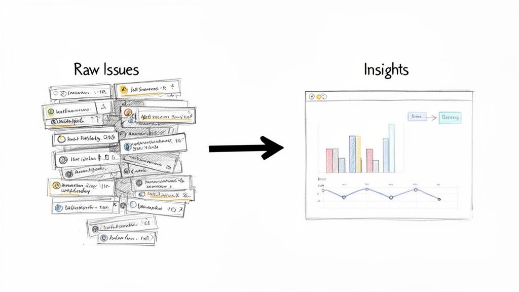
From Data Overload to Actionable Insights
Jira is more than a task manager; it's your project's data hub, capturing every update, bug, and user story. Without clear reporting, this data is just noise. Mastering Jira reports turns thousands of raw data points into a clear, compelling story about your project's health, allowing you to move from simply tracking work to making informed decisions.
Effective reporting helps you pinpoint the exact bottlenecks slowing down your sprints. It empowers you to forecast timelines with confidence and gives stakeholders a real-time view of progress without another meeting. Understanding the principles of business intelligence reporting helps you extract the most value from your data.
Why Jira Reports Are Your Project’s Command Center
Jira's role as a project command center is undeniable. It currently powers workflows on 42,781 websites globally, and its adoption by 0.71% of the top 10,000 sites highlights its critical function in top-tier organizations. This widespread use means a vast amount of project data is sitting inside Jira, ready to be turned into actionable intelligence.
The image above showcases Jira's built-in reports. Each one is a tool designed to answer a specific question about your workflow, helping you make data-backed decisions that move your project forward.
Expert Tip: For organizations where compliance and process integrity are non-negotiable, these reports are more than just progress trackers—they form a critical part of your project's history. For a deeper dive into this, our guide on https://harmonizepro.com/blog/audit-trail-best-practices is a great resource.
The key to effective reporting is to start with a clear objective. What specific question are you trying to answer right now?
Choosing the Right Jira Report for Your Goal
Use this table to match your immediate objective with the best report for the job.
| Your Goal | Recommended Jira Report | Key Insight It Provides |
|---|---|---|
| "Are we on track to finish our sprint work?" | Sprint Report or Burndown Chart | Tracks the remaining work against the time left in the sprint. |
| "How much work does our team typically get done?" | Velocity Chart | Shows the average amount of work a team completes per sprint. |
| "How long does it take to resolve bugs?" | Resolution Time Report | Averages the time it takes to resolve issues. |
| "Where are our biggest bottlenecks?" | Control Chart | Visualizes the cycle time for issues, highlighting outliers. |
| "What's the overall workload distribution?" | Pie Chart Report (with a "Status" or "Assignee" gadget) | Shows how work is distributed across team members or statuses. |
This table is your starting point. As you become more familiar with these reports, you'll learn how to combine their insights for a complete picture of your project's health.
Interpreting Core Agile Reports Like a Pro
Generating a report in Jira is the easy part. The real skill is interpreting what the data is telling you. By understanding the two most fundamental Agile reports—the Sprint Burndown and the Velocity Chart—you can elevate your team's conversations from subjective feelings to data-driven action.
This shifts the discussion from "I feel like we're behind" to "The data shows a potential bottleneck here; let's identify the cause and a solution."
When the whole team can read these charts, it fosters a powerful sense of shared ownership and a proactive approach to problem-solving. Let's break down how to extract actionable insights from these crucial visuals.
Decoding the Sprint Burndown Chart
The Sprint Burndown Chart is your daily pulse check for the current sprint. It compares remaining work against the ideal pace needed to meet your goal. While a perfectly smooth downward line is the textbook ideal, the real story lies in the jagged peaks and valleys. These patterns are not just data; they are signals for action.
A burndown line that stays flat for the first few days of a sprint is a classic red flag. Actionable Insight: This signals a need to investigate immediately. It could mean the sprint planning was flawed, user stories are unclear, or an early blocker has stopped progress. Address it in the daily stand-up to get work flowing.
Another common pattern is the "end-of-sprint cliff"—a sharp drop in the final days. Actionable Insight: This often points to rushed work, skipped testing, or tasks being closed without meeting the Definition of Done. Use this pattern as a trigger to review your team's workflow and QA process in the next retrospective.

These patterns tell you far more than a simple status update ever could.
When you can spot these patterns, you can ask much better questions. Instead of a generic "What's the status?" you can lead with, "I see our burndown hasn't moved in two days. What's blocking us from getting those first few tickets rolling?" It completely changes the conversation.
Leveraging the Velocity Chart for Predictability
While the burndown chart is a daily snapshot, the Velocity Chart is your long-term strategic guide. It shows your team's output over multiple sprints, measuring the amount of work (in story points) they consistently complete. This historical data is your most reliable tool for realistic planning.
It prevents overcommitment, reduces team burnout, and manages stakeholder expectations. If your team's average velocity is 30 story points, committing to 50 in the next sprint is a recipe for failure. The Velocity Chart is your data-driven reality check.
In Jira, you’ll see two bars for each sprint:
- Commitment (Gray Bar): What the team planned to complete.
- Completed (Green Bar): What the team actually delivered.
Actionable Insight: A stable velocity indicates a healthy, predictable team. If you see wild fluctuations between sprints, use this as a prompt to investigate root causes. Are requirements changing mid-sprint? Is the team facing external disruptions? A volatile velocity chart is a clear signal to refine your workflow or improve your team’s focus.
Stabilizing your velocity often comes down to improving communication and refining your processes. If your chart looks more like a rollercoaster, it might be a good time to revisit your team’s dynamics and explore how to improve team collaboration.
By using these two core reports together, you build a system that guides your team toward more predictable, sustainable performance.
Unlocking Custom Insights with JQL
When standard reports don't answer your most critical questions, it's time to use Jira Query Language (JQL). Think of JQL not as a complex coding language, but as a powerful search tool that lets you build a custom Jira report perfectly tailored to your team's specific needs.
At its core, JQL combines fields, operators, and values to filter your issues with precision. It’s the engine behind advanced searches, custom dashboard gadgets, and powerful automation rules.
From Simple Queries to Powerful Filters
You don't need a technical background to start using JQL. Its logical, sentence-like structure allows you to build queries that answer complex questions with a single line.
For example, to find all high-priority, open tasks for an upcoming release, you don't need to manually scan a backlog. Instead, a simple JQL query gives you an instant, accurate list:
project = "Project Phoenix" AND priority = "High" AND status not in (Resolved, Closed)
This query immediately cuts through the noise. From here, you can easily add more conditions, such as filtering for a specific assignee or issues created within the last two weeks. JQL handles these layers of complexity with ease.
Here’s what building a query looks like right inside Jira’s search interface.
This interface shows how you can combine criteria to zero in on the exact list of issues you need for your analysis.
Actionable JQL Snippets for Common Problems
The true power of JQL is its ability to create "early warning systems." By saving specific queries as filters and displaying them on a team dashboard, you can proactively identify risks before they derail your project.
Here are three JQL queries you can implement today to improve your workflow:
-
Find Stale Issues: Pinpoint any ticket that hasn't been updated in a week, indicating it may be stuck or forgotten.
status not in (Closed, Resolved) AND updated <= -7d -
Spot Overdue Tasks: Instantly generate a list of all unresolved issues that have passed their due date.
due <= now() AND resolution = Unresolved -
Monitor Scope Creep: Identify every issue added to the current sprint after it started, helping you control unplanned work.
sprint in openSprints() AND issue in sprint = "Sprint Name" AND created > sprint.startDate
These queries aren't just for pulling lists; they are diagnostic tools. A filter that flags tickets stuck in "In Review" for more than two days isn't just a report—it's a specific talking point for your next stand-up, pointing directly to a bottleneck that needs to be addressed.
Recent research highlights a critical productivity paradox: while 99% of developers save time with AI, 90% still lose over six hours a week to other inefficiencies. This is where targeted JQL reports make a tangible impact, helping teams find and eliminate the workflow friction that consumes valuable time. Dive into the full developer experience report from Atlassian to learn more.
By turning these queries into always-on dashboard gadgets, you make crucial insights visible to everyone, fostering a culture of continuous improvement.
Building a Mission Control Dashboard for Your Team
Individual reports are useful, but a well-designed dashboard is a game-changer. It acts as your team's mission control—a single source of truth that visualizes project health, tracks progress, and flags risks in real-time. A great dashboard answers the "What's the status?" question for anyone at a glance, eliminating the need for constant check-in meetings.
The key is to move beyond simply adding gadgets and start curating a collection that tells a cohesive story.
From Individual Gadgets to a Cohesive Story
An effective dashboard layers different types of information to build a complete picture. For example, take the "Stale Issues" JQL filter and display it using the Filter Results gadget. Now, place it next to a Pie Chart gadget showing issue distribution by assignee.
This combination creates a powerful narrative. You not only see which tickets are stale but can also spot if a single team member is overloaded, causing a bottleneck. This is how you transform raw data into actionable insights that lead to better, faster decisions.
The entire process is powered by a simple, three-step JQL query construction.
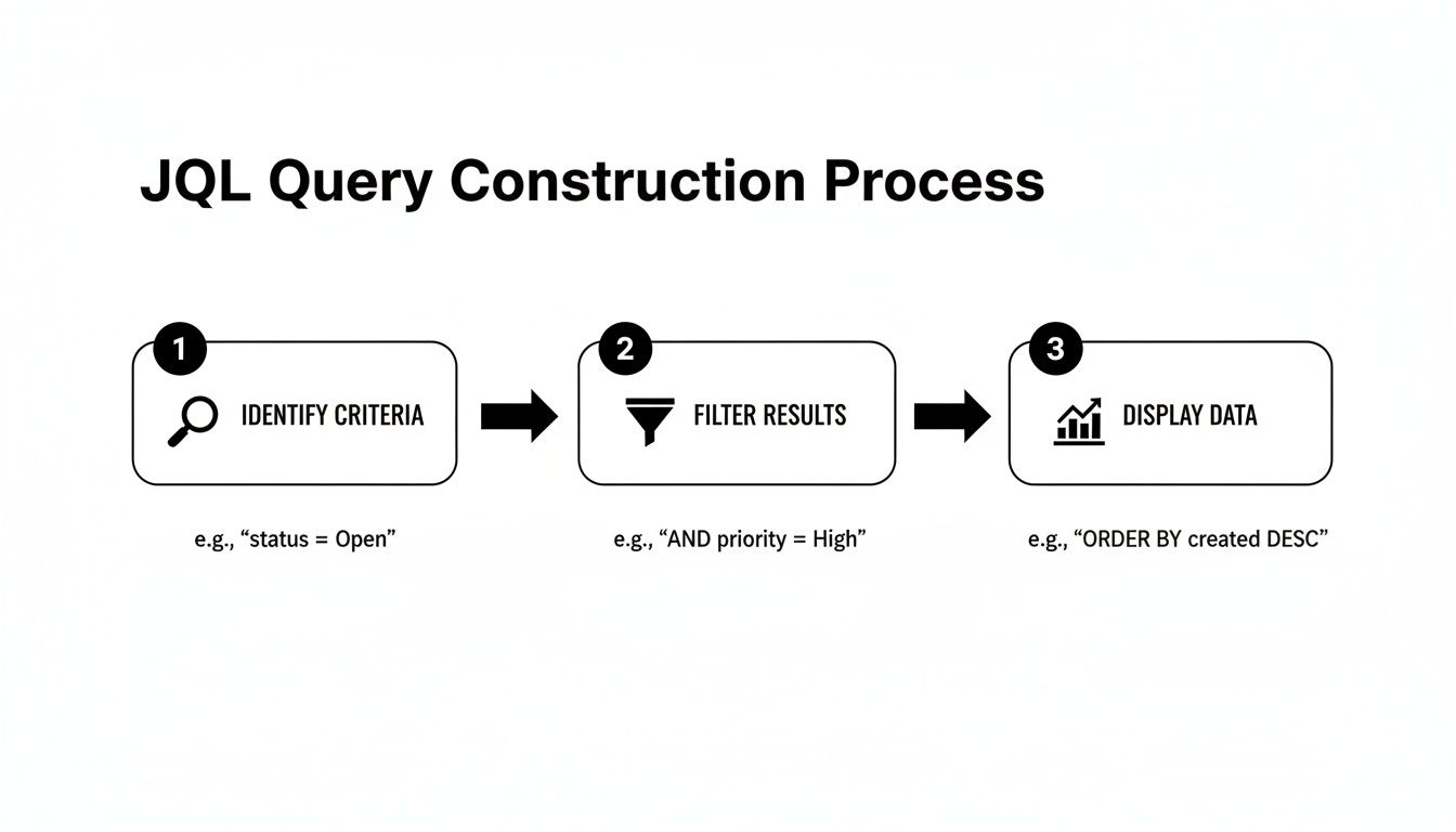
It all comes down to identifying the right data, filtering it with precision, and then displaying it visually. This is the core principle behind every useful gadget on your dashboard.
Essential Gadgets for a High-Impact Dashboard
Choosing the right gadgets is critical. While Jira offers many options, a few consistently deliver the most value. These are the foundational blocks for a dashboard that provides immediate clarity.
| Gadget Name | Primary Use Case | Ideal Audience |
|---|---|---|
| Filter Results | Display a dynamic list of issues from a saved JQL filter (e.g., stale tickets, high-priority bugs). | Everyone |
| Pie Chart | Visualize issue distribution based on a field like status, assignee, or priority. | Team Leads, Managers |
| Sprint Health | Get a quick, color-coded overview of the current sprint's progress against scope. | Scrum Masters, Dev Team |
| Sprint Burndown | Track the team's progress toward the sprint goal, showing work remaining vs. time. | Dev Team, Scrum Masters |
| Created vs. Resolved Chart | Compare the rate of incoming work against the rate of completed work over time. | Product Owners, Managers |
| Assigned to Me | A personalized "to-do" list showing all issues assigned to the logged-in user. | Individual Contributors |
Combine these to answer nearly any question about your team's workload, progress, and potential roadblocks directly from the dashboard.
Crafting a High-Impact Dashboard Layout
For a typical software team, a three-column layout is highly effective. It helps you create a report in Jira that balances immediate sprint concerns with a broader view of ongoing work, serving multiple roles at once.
Use this proven layout as your starting point:
-
Left Column (Sprint Focus):
- Sprint Health Gadget: Your at-a-glance summary of the current sprint—time elapsed, work done, and any scope creep.
- Sprint Burndown Gadget: The daily pulse check to keep the team focused on the sprint goal.
-
Center Column (Team Workload & Blockers):
- Assigned to Me Gadget: A personal to-do list for each team member.
- Filter Results (Stale Issues): The custom JQL gadget to ensure nothing is forgotten.
- Filter Results (High Priority Bugs): Keeps the most critical fixes front and center.
-
Right Column (Big Picture View):
- Pie Chart (Issues by Status): A high-level view of work distribution across your workflow.
- Created vs. Resolved Chart: Helps you determine if the team is keeping up with incoming work.
Remember, the best dashboards are living documents. Don't be afraid to experiment. Swap gadgets, tweak the layout, and—most importantly—ask your team what they find useful. Adjust it based on what provides the most clarity and drives the most action.
A final pro tip on permissions: configure your dashboard so the core team sees all the granular details, while a separate, simplified version is shared with leadership showing only high-level progress charts. This tailored approach ensures everyone gets the right information without being overwhelmed.
Advanced Reporting Tactics and Best Practices
You've mastered the built-in reports and built a solid dashboard. But what happens when you need to answer questions that span beyond a single project or require combining Jira data with other business metrics? To unlock the deepest insights, you need to take your data outside of Jira.
Exporting issue data to a tool like Google Sheets or Microsoft Power BI unlocks a new level of analysis. You can merge Jira metrics with other business data to give stakeholders a panoramic view. Imagine correlating development velocity with customer support ticket volume—you could instantly see how a new feature release impacts bug reports and support requests.
Extending Jira With Marketplace Apps
For more powerful reporting directly inside Jira, turn to the Atlassian Marketplace. It's filled with apps designed to solve specific reporting challenges that Jira's native tools don't address.
A common challenge is tracking the true progress of an Epic with dozens of sub-tasks. Doing this manually is a nightmare. A specialized Marketplace app can automatically roll up the progress of all child issues, giving you an accurate, real-time view of the parent task's status without any manual effort.
The most effective teams treat Jira not as a closed system, but as a central data hub. They extend its capabilities with apps and connect it to other tools to answer complex business questions that drive strategic decisions.
This ecosystem is growing rapidly. Atlassian recently hit 120% cloud net revenue retention, a figure driven largely by enterprise adoption and the expanding Marketplace. This signals that Jira Cloud is scaling to meet even the most demanding reporting needs.
Troubleshooting Common Reporting Headaches
Even experienced Jira users encounter reporting issues. A report your team can't trust is worse than no report at all. Knowing how to quickly diagnose common problems is a critical skill.
Here's how to troubleshoot two of the most frequent issues:
- "My Burndown Chart Isn't Burning Down!" A flat or upward-trending line is almost always caused by scope creep (adding new issues to an active sprint) or re-estimating story points on in-progress tickets. Use this pattern to start a conversation about protecting sprint scope.
- "My JQL Query is Pulling in Weird Results." This often comes down to a simple operator mistake. A common error is using
=for a text field search when the~(CONTAINS) operator would provide the more flexible results you need. Always double-check your operators and field names to ensure accuracy.
Essential Best Practices for Clean Reporting
Ultimately, accurate reporting depends on clean data. If your Jira instance is disorganized, your reports will be unreliable. A few disciplined habits can prevent major headaches down the line.
Start by enforcing a strict and descriptive naming convention for all saved filters and dashboards. Instead of a vague name like "Dev Team Filter," use something specific like "P2+ Bugs – Mobile App – Unresolved." This instantly clarifies its purpose and prevents the clutter of duplicate, confusing filters that pollute your instance.
For a deeper dive into these foundational habits, check out our complete guide on best practices in Jira.
Answering Common Jira Reporting Questions
Even with the best tools, you'll encounter specific challenges when creating reports in Jira. Overcoming these common hurdles is key to transforming your data into a reliable source of insight. Let's tackle some of the most frequent questions teams face.
One of the most common issues is permissions. A team member creates a perfect JQL filter and adds it to a shared dashboard, but their colleagues can't see the results. The Fix: The JQL filter itself must be shared with the same project, group, or users who have access to the dashboard. Check the sharing settings on the filter to resolve this.
How Can I Report on Story Points for Sub-Tasks?
This is a major pain point for many teams. By default, Jira’s Agile reports roll up estimates at the parent issue level (like a Story or Bug) and ignore any story points assigned to sub-tasks.
This makes it difficult to get accurate velocity or burndown charts if your team breaks down work into estimated sub-tasks. Here are two practical solutions:
- Marketplace Apps: Many reporting apps are built specifically to solve this. They can aggregate story points from sub-tasks up to the parent issue, giving you charts that reflect how your team actually works.
- Automation Rules: Create an automation rule that copies the story point value from a sub-task to a custom field on its parent. Then, configure your reports to use that custom field for estimation.
Can I Schedule a Report to Be Emailed Automatically?
Teams often need to send key reports on a regular schedule, like a weekly summary of resolved issues for leadership or a daily bug report for QA.
Jira Cloud’s native features for this are limited. You can subscribe to a filter to receive email updates on a list of issues, but you can't automatically email a visual report like a Pie Chart or Burndown Chart.
For this functionality, you'll need to turn to the Atlassian Marketplace. You'll find numerous apps that offer robust subscription features, allowing you to schedule and email rich, visual dashboard reports as PDFs or images to any stakeholder—even those without a Jira account.
Mastering these reporting nuances is a core part of effective project management in Jira, providing the clarity your team needs to deliver consistently.
Stop letting manual steps and missed handoffs slow down your team. Harmonize Pro's Nesty app for Jira turns your complex processes into automated, self-managing workflows directly within your tickets. Enforce your Definition of Done, automate QA handoffs, and ensure every step is completed in the right order, every time. Discover how Nesty can bring order and automation to your most critical workflows.